| A | B |
|---|
| ascenders | parts of letters that go higher than the x-height, 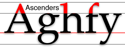 |
| descenders | parts of letters that drop down below the baseline, 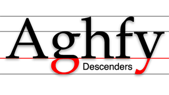 |
| baseline | the invisible line that most of the letters sit on, 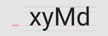 |
| serifs | little flairs at the ends of characters, 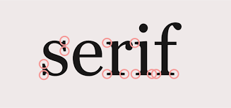 |
| weight | thickness of the line in a character, 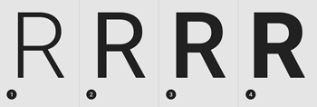 |
| x-height | the invisible light that is the top of most lower case letters, 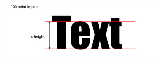 |
| stress | the angle when you connect the thinnest parts of a letter together, 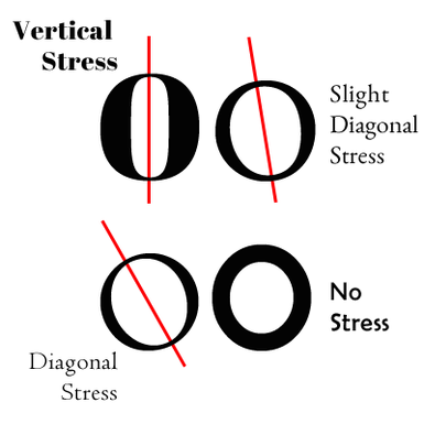 |
| thick/thin transition | the difference in some letters and fonts between the thickest part of a letter to the thinnest part, 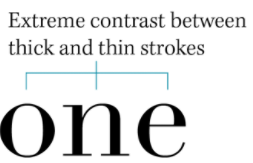 |
| Dramatic Thick/Thin Transition | used in Modern fonts with very skinny parts of letters and very fat/thick parts of letters. Keyword "Nicki Minaj", 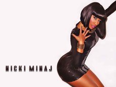 |
| Mild Thick/Thin Transition | used in Oldstyle fonts with kind of medium parts and kind of thicker parts of letters. Kind of like Taylor Swift, 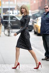 |
| Counter | the empty space in an enclosed or partially enclosed letter, 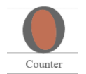 |
| # of main categories of fonts | 6,  |
| Oldstyle Fonts | have slanted serifs with diagonal stress and medium thick/thin transition, 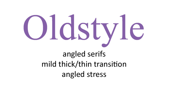 |
| Examples of Oldstyle fonts | Times New Roman, Georgia, 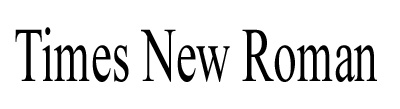 |
| Modern Fonts | thin flat serifs with dramatic thick/thin transition and vertical stress, 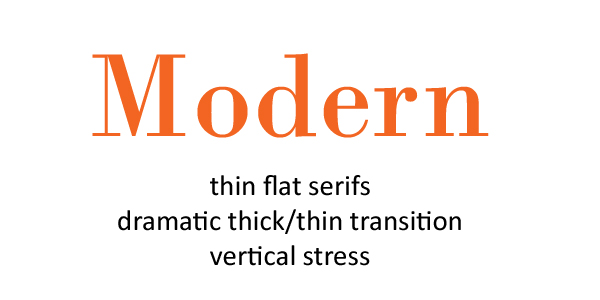 |
| Examples of Modern Fonts | Abril Fat Face, Bodini, 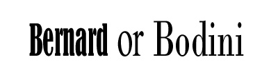 |
| Slab Serif Fonts | thick brick-like serif with no thick/thin transition, 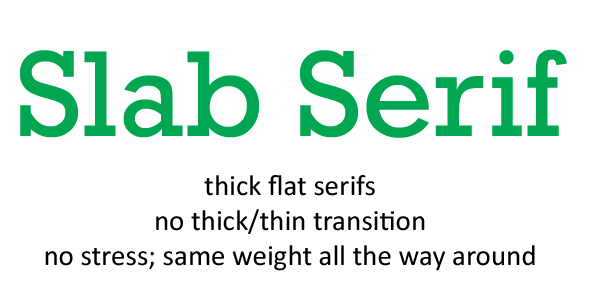 |
| Slab Serif Examples | Rockwell, Slabo, 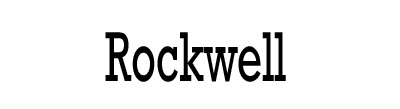 |
| Sans Serif Fonts | fonts with no serifs or thick/thin transition, 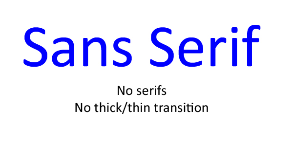 |
| Sans Serif Examples | Helvetica, Arial, Calibri, 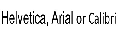 |
| Script fonts | fonts that look handwritten; formal or informal, 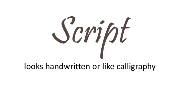 |
| Script examples | 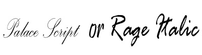 |
| Decorative Fonts | Ornamental fonts sometimes pictures, symbols or artistic flairs, 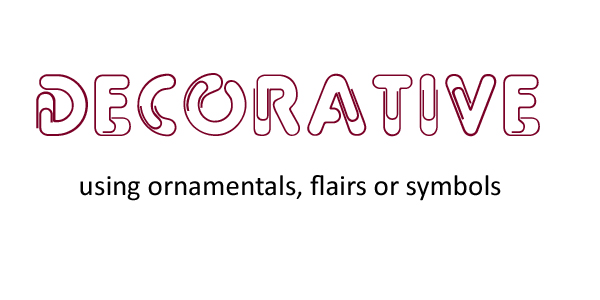 |
| Decorative Examples | 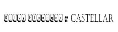 |
