| A | B |
|---|
| Serif | "Feet" on letters, easier to read, 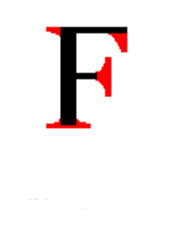 |
| Sans serif | Letters without "feet", 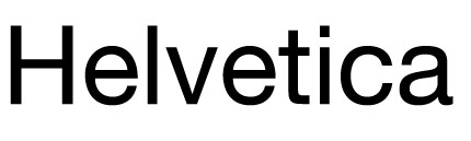 |
| Baseline | Imaginary line that type sits on |
| Descender | Part of a letter that extends below the baseline, 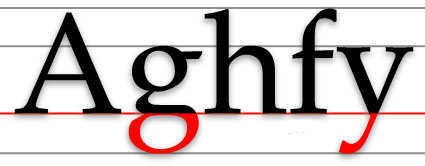 |
| Ascender | Parts of a letter that extends above the x-height, 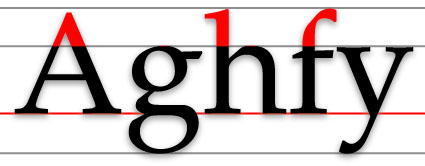 |
| Bowl | Rounded part of a letter, 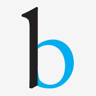 |
| Counter | The inside part of a closed letter., 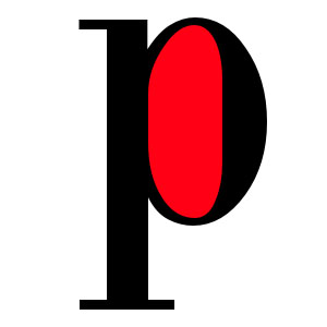 |
| X-height/Body height | Distance of letters from the baseline to the top of a lowercase letter., 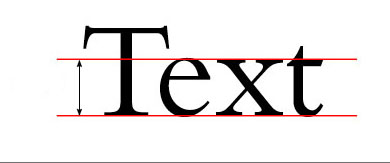 |
| Body copy | Text that is 14 pt or smaller. |
| Display type | Type over 14 pt, used for headlines. |
| Ligature | Letters that are linked together, 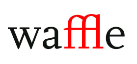 |
| Kerning | Space between individual letters., 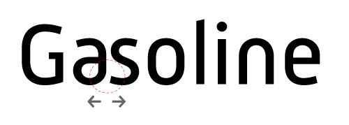 |
| Tracking | Space between groups of letters, 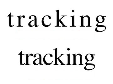 |
| Em dash | A long dash, 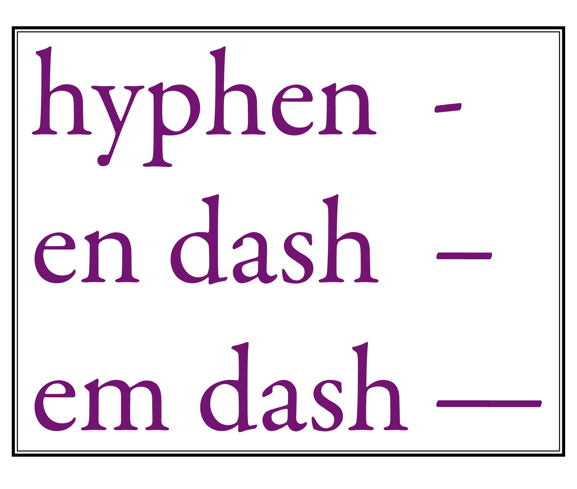 |
| En dash | A dash 1/2 the size of an Em dash, |
| Em space, En space | A way to insert a certain amount of space, 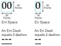 |
| Picas, points | Units of measurement. 6 picas = 1 inch, 12 points = 1 pica |
| 12/14 | A way to write that you want to use 12 point type on 14 points of leading |
| Widow | An excessively short line at the end of a paragraph. |
| Orphan | A line at the end of paragraph that gets left at the top of a column |
| Justified, Left, Right Type | 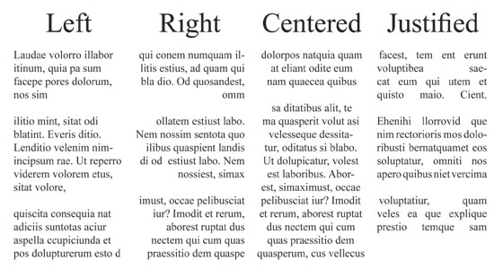 |
| Leading | Space between baselines of text, 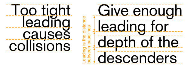 |
| Drop Cap | A cap at the beginning of a paragraph that is larger than the other text., 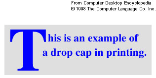 |
| Postscript Font | Smooth, detailed fonts. Printers like these fonts. |
| TrueType fonts | Fonts that can be scaled to any size. Often supported by Windows. |
| OpenType fonts | Cross-platform fonts and often have "pro" in their name. |
| Multiple-master font | The pre-curser to OpenType. |
| Ellipsis | Three evenly spaced dots. Created by hitting "option ;", 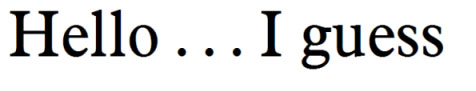 |
| Font family | A font and all of its bold and italic fonts., 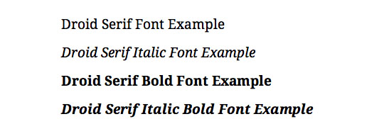 |
| CRAP Theory | Designing using contrast, repitition, alignment, and proximity, 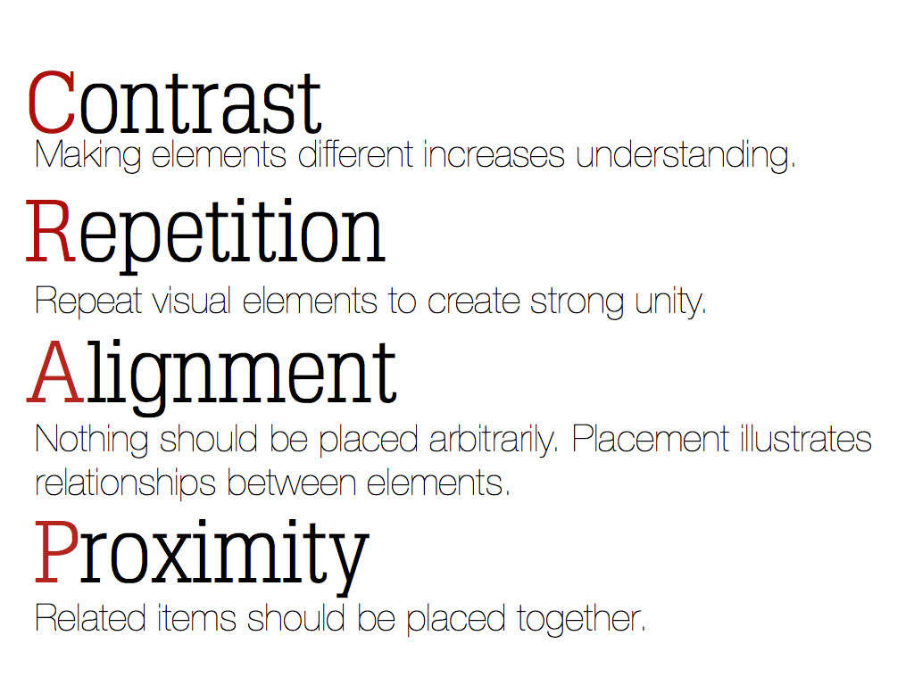 |
| Proofreaders Marks | Marks used by designers to indicate type changes, 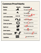 |
