| A | B |
|---|
 | Column chart |
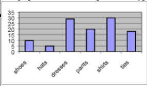
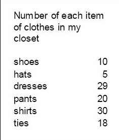 | the best graph for this data is a bar graph |
 | This information would be better displayed as a line graph |
 | The purpose of the regression line is to show a a trend in data |
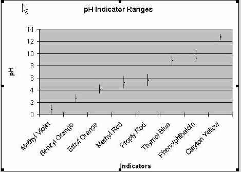 | There is no indicator of 7.8 pH |
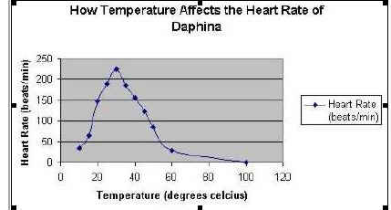 | The dependent variable is the heart rate |
 | The Y axis needs to be adjusted because the data is distorted. |
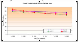
 | This data would be best for a double column graph |
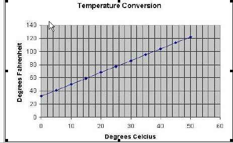
 | The temperature data in this graph would be best displayed as a line graph. |
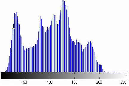 | Histogram |
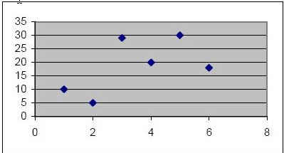 | Scatter Plot |
 | Pluto has the least gravitational pull |
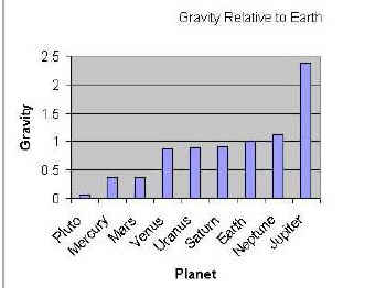 | A person weighs 240 lbs on Jupiter |
| The graph is distorted and the scale of the Y axis should be changed |
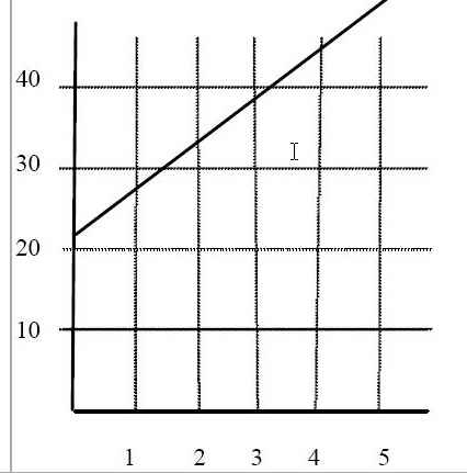 | The graph show the car accelerated of 5 seconds. |
